-
Main / List of articles / How to create an html5 stretching in Google Web Design
Google Web Design: How to create an html5 stretching. Features of working with displacement groups for stretching banners.
Table of Contents— Stretching with One Breakpoint and Central Content. The Peculiarity of Displacement Work
— Consider displacement when working with a "group" and objects within It
PrefaceThis publication aims to explain the process of creating a stretched design in the Google Web Designer. Many tutorials that I have skimmed over explain the “subtlety” of the “displacement” work within the stretching. Namely, this particular detail is responsible for the correct display of a stretching banner.
A Little TheoryWhat is a “rubber” (stretchable) HTML5 banner? It is a banner which stretches to the full allowable width of a website and fills its entire available space. Usually, banners are stretched horizontally across the website, but it’s also possible to discover placements in which a banner is stretched vertically.
Let’s consider the challenge of creating an adaptable banner for desktop use on a website. The general structure of this banner would then be as follows:

It is important to note that the banner has a minimum size. This is the size within which, within the minimum browser window, an advertising banner will be guaranteed to be displayed correctly. On many sites, this size is usually 840, 960, 970 or 1025 pixels. The exact minimum size is always indicated in the technical requirements of the advertising platform.
We will take as a basis for our banner a minimum stretch size of 970x250 pixels.
Stretching with one breakpoint and central content. The peculiarity of displacement workLet’s go through the process of creating a stretch from the very beginning and understand how the minimum sizes of the banner affect the stretch itself and its displacement.
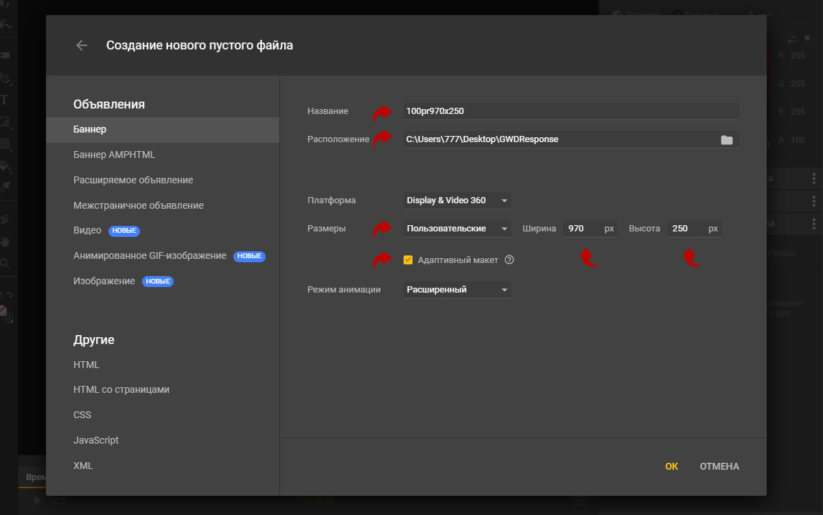
Create a file with the correct name for the stretch - “100pr970x250”, where 100pr is “100%”, 970 is the minimum size indicator and 250 is the height of the banner. We will select “custom size settings” and specify the size in pixels.
Also, we will check the “adaptive layout” box. This option will help us to create an adaptive banner in the Google Web Designer program.
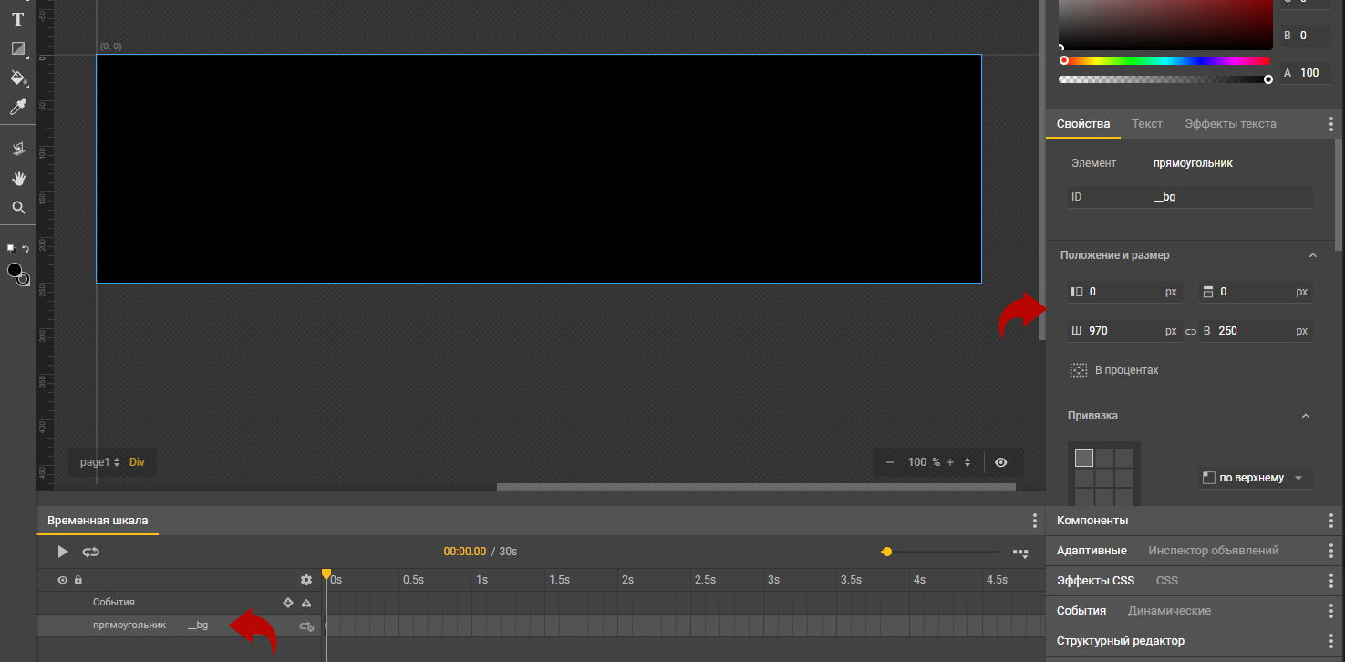
Now let’s create a background template that will stretch to the full width of our banner. In the “Position and Size” field, we’ll set the placement at zero coordinates and the size 970x250. Also, for convenience, we can specify an “ID” for this layer, which will visually distinguish it from all the layers. In this case, we named the background “_bg”.
Now, let’s make our background always stretch to the full width of the banner, even if this width is more than 4k, we’ll see our background stretched.
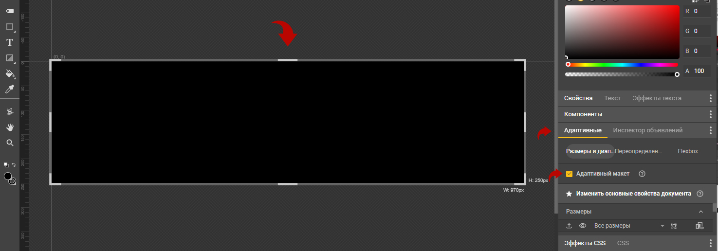
To do this, go to the “Responsive” tab and check the box “Adaptive Layout”.
As soon as you do this, a banner will appear with a frame, which you can pull in different directions. Do not touch it yet, just pay attention to its appearance.
Now, let’s go back to the “Properties” tab. In it, we will find the “position and size” property block and find the field responsible for the width of the banner. Now it says 970 pixels. Click on the word “px” and select the “%” symbol. Once you select the display of width as a percentage, your 970 will change to 100. Now your background will always be 100%.
Now we can check if our background is stretching. We will pull the right side of the white banner frame and see that the background stretches along the entire length of the frame.
Return the size of the banner to its initial position if you have changed it. I usually press “cntl+z” and return the banner to the desired width. In this case, it is equal to 970 pixels.

We won’t need to return to this layer again, so we’ll lock it by clicking the ‘lock’ icon next to the layer in the timeline.
Now let’s get into the magic of working with stretch in Google Web Design.
We’re now going to start creating a container that needs to stay centered in the banner, regardless of the banner’s width.
I’m going to purposely do something ‘not quite right’ to emphasize the importance of working with ‘offsets.’ And then I’ll show you the exact kind of challenge designers face when working with stretch in Google Web Design.
Let’s say we start by creating a central container with some text. We’ll write the phrase ‘Some Content’ in the center of the banner and center it in the middle of the banner, then place it in a group.
To put an object into a group, we need to select the object and right-click on it in the banner field. Then we need to choose ‘create group.’
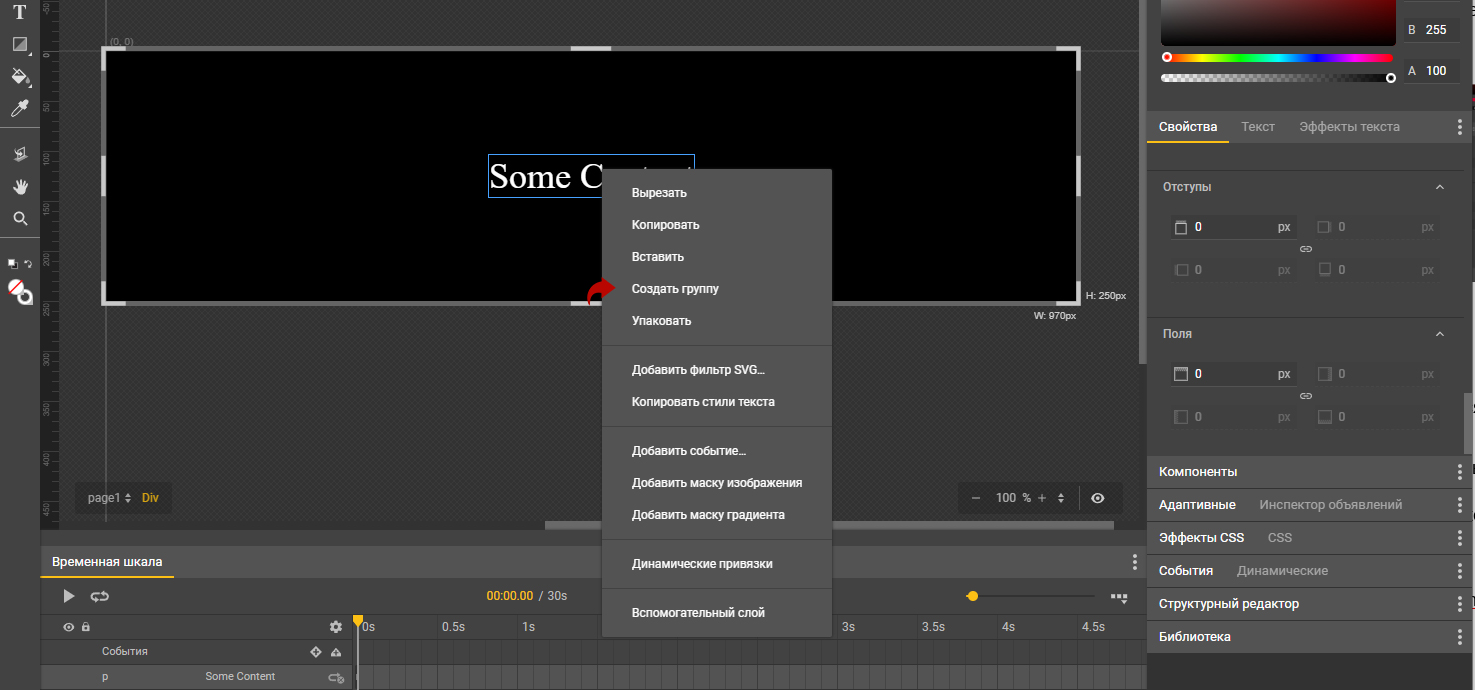
Next, you’ll see a modal window where you need to specify the ‘name’ of this group. My standard name is ‘main’.

The group is created.
If we select the group and look at it in the timeline field, we’ll see that now the field is called ‘group.’ Let’s specify a name for it in the ‘id’ section of the ‘Properties’ field so we don’t get confused.
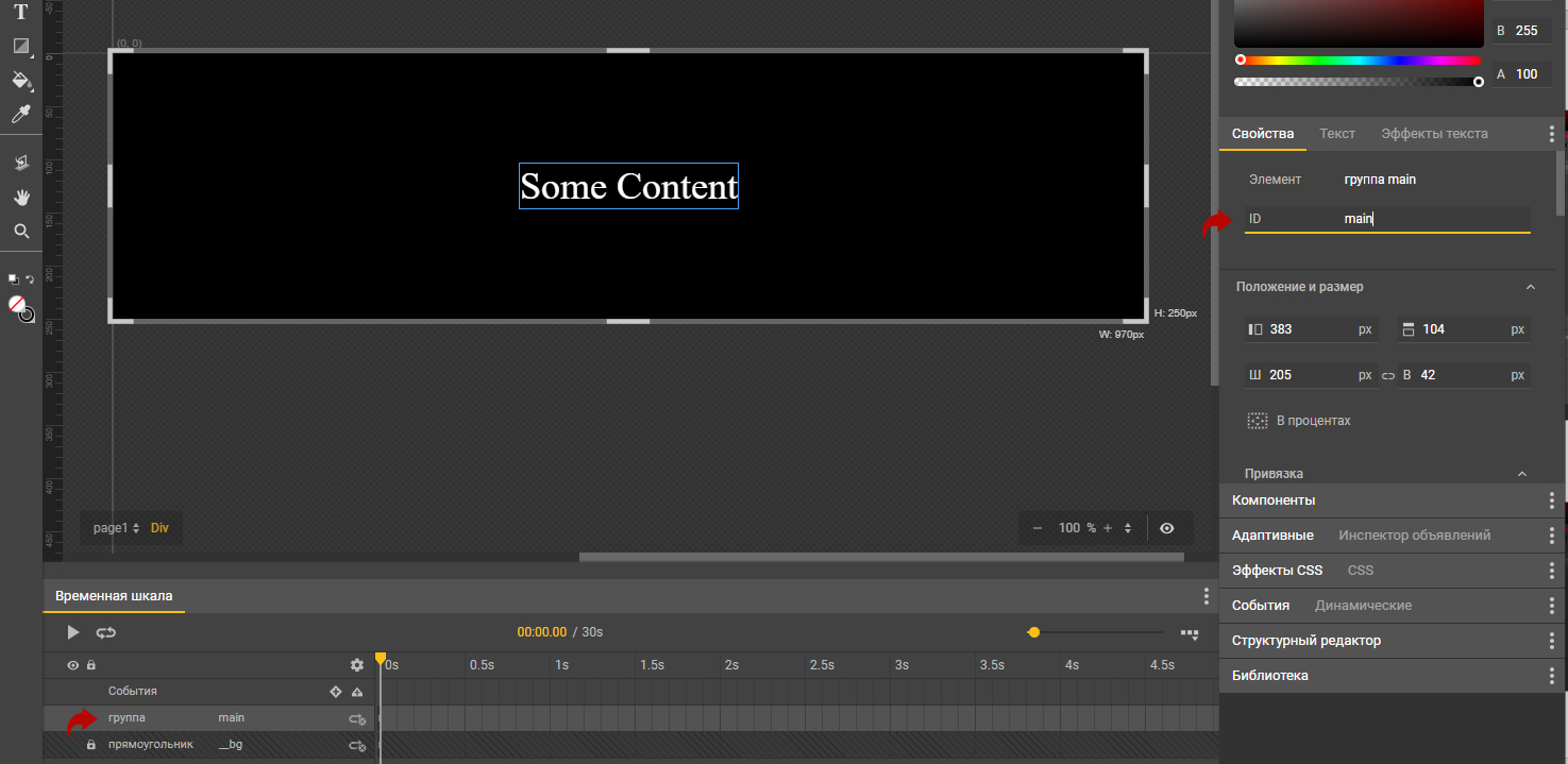
Now let’s make the group move exactly in the center of the banner.
This is where the magic of ‘offset’ begins. Select your group and in the ‘position and size’ section in the ‘Properties’ block, find the parameter that controls the ‘horizontal position.’ Now let’s choose a percentage placement by clicking on ‘px’ and see how the placement percentages appear instead of the placement coordinates. In order for the content to always be in the middle of the banner, we need it to be placed at 50%. Let’s set this.

If you strictly followed the instructions, your group should have moved ‘to the right.’
The peculiarity of elements in the Google Web Design program is that the group’s coordinates are counted from the top left corner of the object. Consequently, our object is aligned to the left side of the banner by its left side at exactly 50% of the banner.
And in order to center the group in the center, we will need to move our entire group ‘half’ the width of the group to the left.
To do this, let’s remember the width of our group (205 px) and scroll down to the ‘Transformation, Rotation, Scale’ section in the Properties block. In this block, we need to check the ‘Absolute value’ box and in the ‘X’ coordinate, we need to indicate ‘minus half of the width of our group.’ Our group is 205px, so let’s enter ‘-102’ in the ‘X’ field.

After specifying the ‘offset,’ your group will be centered in the banner. Now you can drag the banner to see how our group is placed. Exactly in the center.
Let’s look at how offsets work with groups and objects within themNow let’s work with the group a little bit and the objects within it and see how changes can mess up the positioning of the central group.
Let’s go inside our group by double-clicking on it and change the elements.
Suppose we want to add some background, image, or something else that is wider than the initial text. For example, let’s add this background.
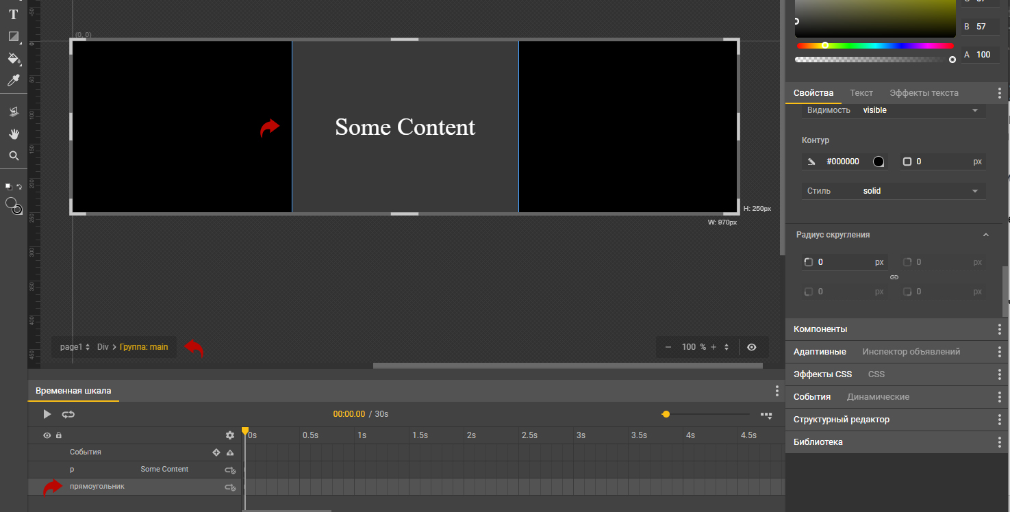
We have created a background that is somewhat ‘wider’ than our initial text. If we exit the group and try to drag the banner, we see that the content is no longer exactly in the middle of our banner.

This is a feature of collecting stretches within Google Web Design. By changing the content of the inner group, you can change the size of this group. At the same time, the ‘offset’ settings have not been adjusted.
Let’s fix everything.
First, select our group and specify the placement in the ‘Position and Size’ block at ‘50%’ in the ‘X’ coordinate.

Next, in the ‘Transformation, rotation, scale’ section, in the ‘X’ coordinate we specify the displacement to the left by half the width of our group - ‘-165px’.

Now, let’s pull our banner and make sure that the positioning of the group takes place exactly in the center.

This nuance is very poorly explained in many manuals for the development of stretched banners in Google Web Design, but it is key to creating a banner stretcher.
Congratulations!
You have dealt with the offset for groups, which means that now you know how to make extensions with centrally placed content.
