-
Main / List of articles / How to prepare HTML5 stretch banner in Adobe Animate
Adobe Animate. How to prepare an HTML5 stretch banner? From simple to complex, with code examples and source materials.
Оглавление— Script for stretching with one central element
— A script for stretching with one central element and a stretching background, a button
— Stretch with two breakpoints
— Script for stretching with one central element, two breakpoints. Mobile and desktop
— Placing content in percentage positions
— Script for stretching with one central element and placing objects at percentage positions
ForewordThis publication aims to provide a detailed exploration of the process of creating scalable banners. All the script material presented here is compatible with Adobe Animate software versions 19 and later. You are free to use the provided scripts, copy, and paste them into your project.
A Bit of TheoryWhat is a 'responsive' (stretchable) HTML5 banner? It's a banner that stretches across the entire allowable width of a website, filling all available space. Typically, banners are stretched 'width-wise' across a site, but placements can also be found where the stretch extends vertically.
It's important to note that a significant portion of content in today's world is viewed on mobile devices. We know that mobile devices have significantly different screen resolutions compared to computer monitors. Considering this, a keen observer will immediately note that if a banner scales to fit the entire content width, 'in theory,' one could create banners that would be equally effective on both desktop and mobile devices. However, technical limitations arise on web platforms with such banner concepts. Sometimes, even if you manage to create such a banner, it might be challenging to fit all its content in a way that successfully passes moderation on the respective platform.
Let's start with a more specific approach.
Let's consider the task of creating an adaptive banner for use on the desktop version of a website. In this case, the general structure of such a banner would be as follows:
We see the boundaries of the website, which include an adaptive banner stretching from edge to edge, and content placed in the center of this stretched banner.
Level 0: Stretching with a single breakpoint and center-aligned content inside the banner.
It is important to remember the following: Websites have adaptive width, allowing us to place adaptive banners; however, the desktop version of the site has a minimum size where the banner content must display correctly. For example, when opening the desktop version of the Rambler.ru website on a monitor with a resolution of 2560 pixels, we notice that the banner's stretching area extends to the full width of the browser, but the content is limited to a size of 1260 pixels. However, if we open the same page with a resolution of 1259 pixels or less, we'll observe that neither the banner nor the site's content shrink below the size of 970 pixels.
When considering the technical platform requirements, we note the specified minimum size of 970 pixels.
So, let's delve into how to create a similar banner.
To simplify understanding adaptive banners, we'll assume that the content is always centered within the banner.
Later on, we will explore more complex implementation options and delve deeper into aspects of adaptive banners.Throughout my career working on banners, I've created over 5000 HTML5 stretches. Stretching with center-aligned content represents the most straightforward concept for these adaptive banners, ensuring maximum comfort for users viewing on larger monitor screens.
Let's open Adobe Animate software version 19 or higher and attempt to accomplish this task. I'll demonstrate my process of creating such adaptive banners as I find this process to be the most convenient and effective.
Let's start the project by specifying the minimum allowable banner dimensions: 970 by 250 pixels.
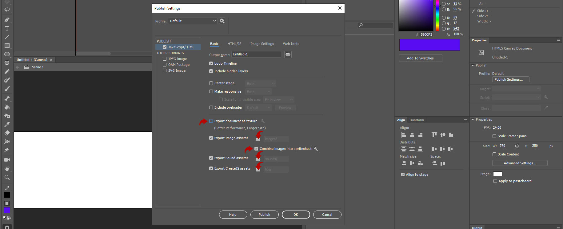
Let's navigate to the «Publish Settings» panel and on the «Basic» tab, adjust the settings.
Let's navigate to the «Image Settings» tab and configure the export of images from the banner.
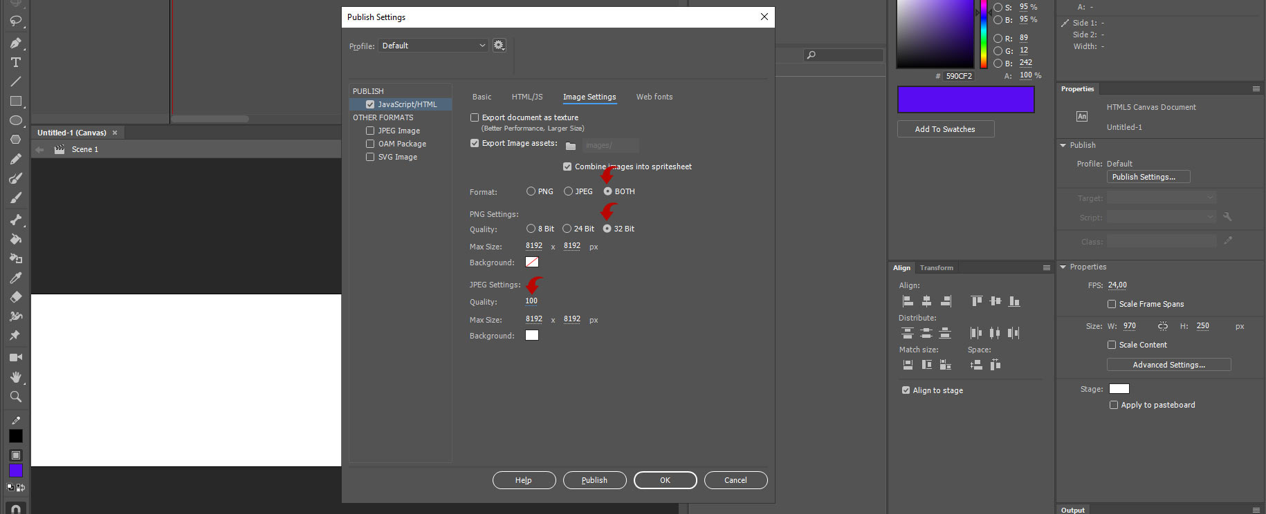
Confirm the settings by clicking the «OK» button.
Let's also set the frame rate (FPS) for the banner to 30 frames per second in the «Properties»section (if this tab is unavailable, you can activate it in the top menu «Window»). From personal experience, I can say that 30 fps is the most optimal frame rate considering working with the timeline and the quality of the exported animation.
Let's save the project in a folder and give it a professional name. My naming convention always reflects the functionality and size of the banner. Since this is a stretch, let's name the banner 100pr970x250 (where 100pr is the stretch marker, 970 is the width, and 250 is the height).

Now we are all set to begin preparing the banner. It will consist of simple elements: a background, a central text, and a button. (If you are unfamiliar with the timeline and its methods, you can learn to work with it here - https://vk.com/@bannersbox-kak-sozdat-html5-banner-v-adobe-animate-cc)
After creating these elements on separate layers, we'll obtain the following structure of the HTML banner.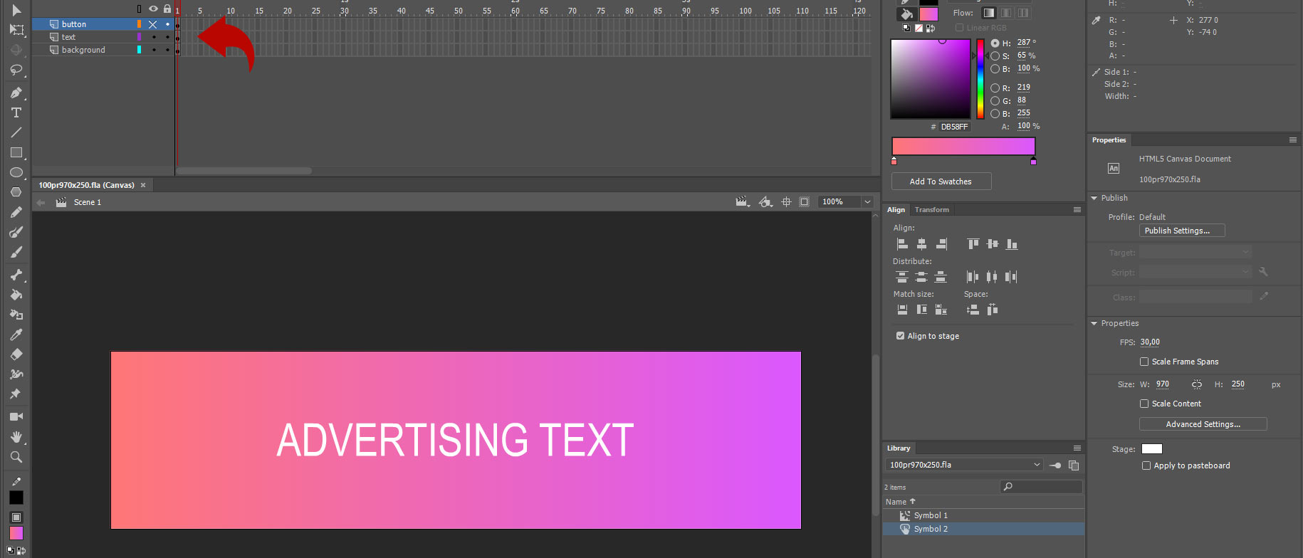
At the moment, we have the minimum size of the banner. However, we should understand that the stretch banner extends to the sides. Hence, there should be 'something else' beyond the standard view.
In the classic approach, the same color is applied on both sides of the banner, connecting the lateral colors of the minimal-sized banner with identical gradients. For simplicity and understanding, for now, let's proceed with the classical approach.
Let's create a layer above the background and place two identical gradients there. Underneath the background layer, we'll create another layer where we'll position a strip with our unified color. In the future, we'll stretch it, and it will act as a background where the 'minimal' area of the banner ends.
It should roughly look like this.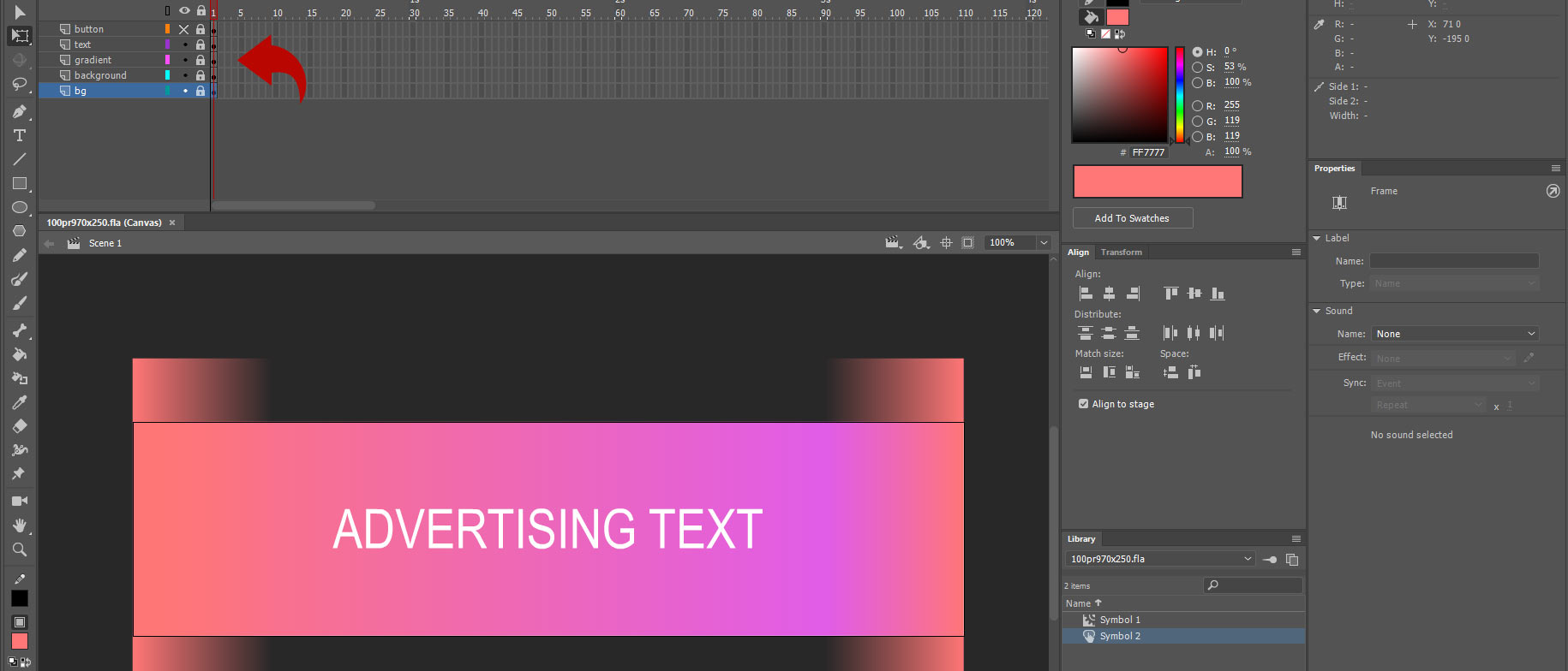
"I intentionally placed the gradients above the layout to illustrate how I applied them over the background. This method helps to blend the sides of the banner's background.
Additionally, I've added a very basic animation to make the banner a bit more engaging.
At this point, let's consider that the banner in its minimum size is ready. Let's proceed to formulating the structure of the stretch itself.
According to our initial task, we need to implement a stretching banner with all content centered within the banner. It should adjust to any width but not less than 970 pixels wide.
Let's take a look at the structure of such a stretch:
We need to place all the banner content (excluding the background and click button) within a specific container that will loop infinitely. Then, we need to write a script that tells the container to always remain centered on the screen along with all the animation. Below our container with the animation, there will be a background that extends far beyond the length of the banner. Above the animation container, there will be a button that is also much longer than the container to overlay it at any screen width.
The container that will hold the animation will be a movie clip. We'll move all the animation into it. To do this, we'll create an empty layer, place a regular rectangle of any size on it, and position it exactly in the center of the banner using the 'Align' panel for alignment. This will give us the following result: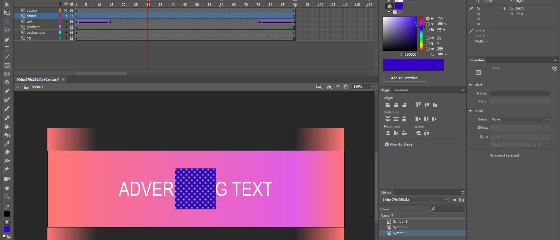
Next, let's convert the rectangle into a movie clip with the anchor point positioned at the center.

After that, double-click to enter inside the created movie clip and select the rectangle. Set its transparency to 0, rename the layer as the symbol «_» , and create a new empty layer. Once all these steps are done, exit the movie clip and return to the outer level.
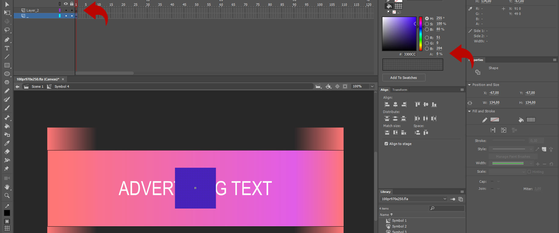
Afterward, we need to move all the animation inside the created movie clip. Just to remind, we are moving only what pertains to the fixed banner.
To do this, select the layers containing the animation and copy them to the clipboard.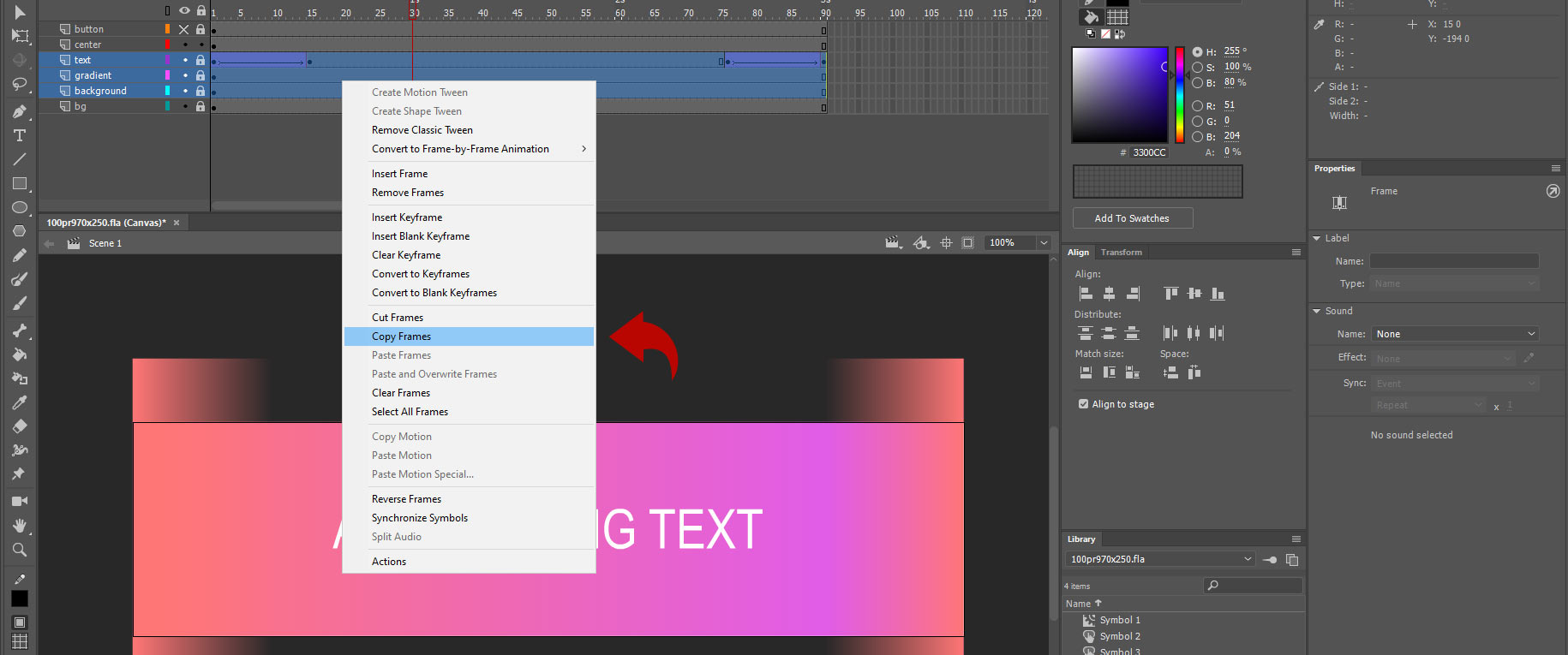
Next, go back into the movie clip and paste the animation onto the empty layer.
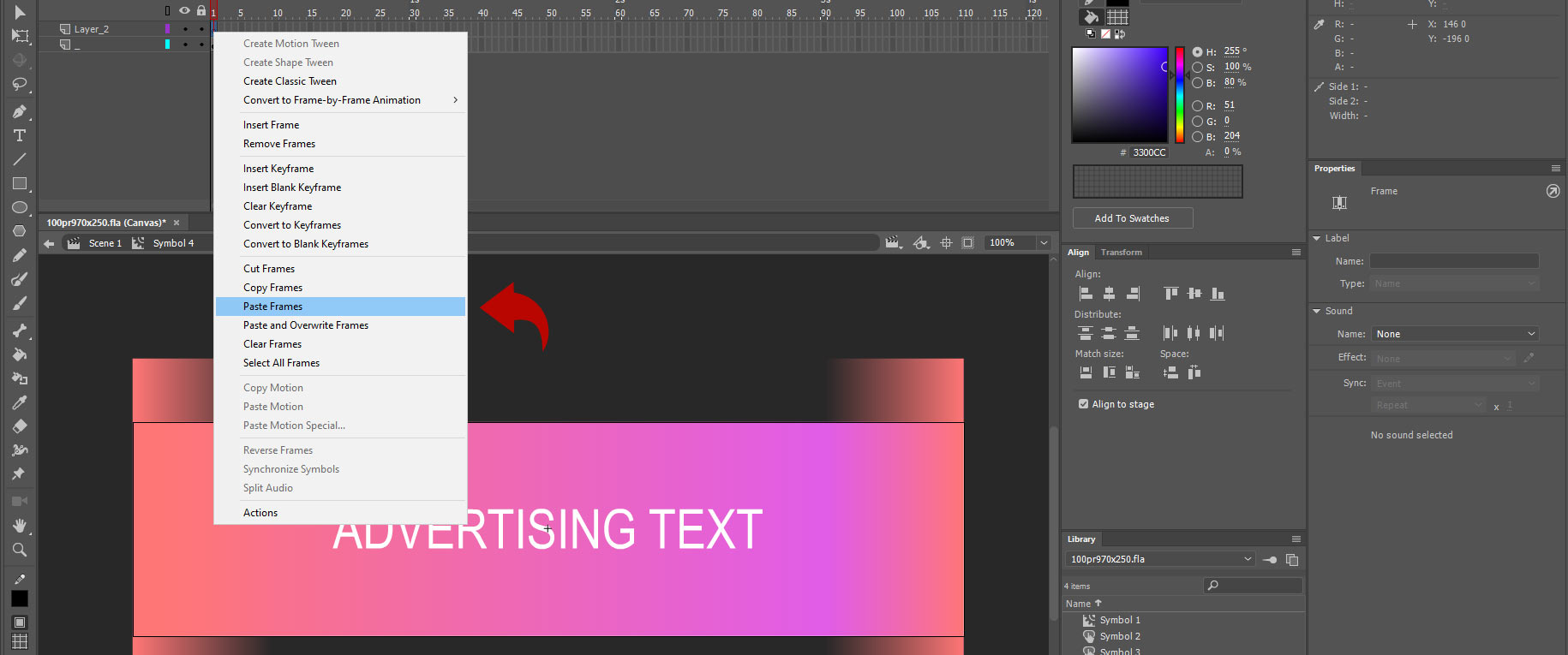
If done correctly, instead of an empty layer, you should see 3 layers with animation, with the same names as they were in the root level of the banner. If all alignments were maintained, the animation should visually appear in the exact same position.

Next, return to the root level and delete the copied layers. The animation is now cyclic and inside the movie clip. As all the animation is within the movie clip, we need to leave only one frame at the root level.
Now, we need to create an empty layer where the control script will reside. Let's name it «__script». Here is how our structure at the root level of the banner looks now:
To control our movie clip using a script, we must give it a name. This allows the script to locate this specific movie clip and set its parameters.
Here's how it's done: select the movie clip and in the «Properties» panel, specify Label with the name «center».
After all these manipulations, we need to make the button and background beneath the banner as wide as possible. It's important to consider that users have different screen widths, but they should correctly see the banner's background and be able to click the button on any screen width.
Since we are considering a straightforward approach, the solution for these two tasks will be simple. We should unlock the button layer, select it, and set its width to 5000 pixels (this value has been chosen empirically, as buttons usually don't require greater width). The same needs to be done for the background layer.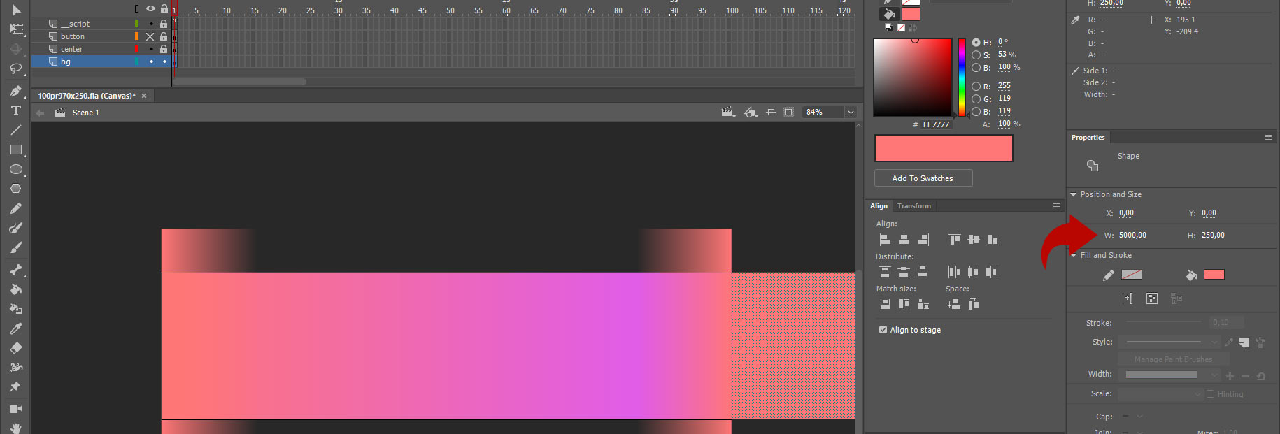
Next, the layer with our clip can be locked. It's not needed for further manipulation with the programmatic centering on the screen.
Let's move on to the control script.
Select the “__script” layer with a mouse click and press the F9 key. Once you do this, the “Actions” tab should open for you.
Let's begin entering the code into the banner.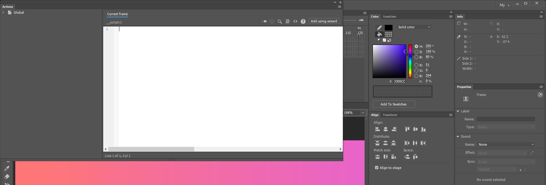
Writing the following code:
var thisStage = this;
window.addEventListener("resize", resize, false);
The first line of code means that the variable is attached to the code scope from the current part of the code. There's no need to try to comprehend this; we're not engaged in programming here. Let this line just be here.
The second line indicates that we'll be 'listening' for changes in the browser's size, and upon each change, we'll call the resize() function.
Next, we need to define the resize() function. This is where we'll control our Movie clip and position it in the center. Let's create it as an empty shell for now. It looks like this:
function resize() { }
The following line will call the execution of this function once because no one changes the browser's size when it loads. Therefore, we need to make this function run once. It's done like this:
resize();
Let's summarize all the previously written code and describe it as a single block:
var thisStage = this;
window.addEventListener("resize", resize, false);
function resize() {
}
resize();
So, we have a one-time function call and also a call to the same function whenever the browser's size changes.
Next, let's understand how the resize() function works.
Its task is to position our movie clip in the center of the banner with all its contents. We need to add the following lines of code between “function resize() {” and “}”.
var w = window.innerWidth * window.devicePixelRatio;
As the first step, for convenience, we place the browser window's values into a variable. Pay attention to the multiplier 'window.devicePixelRatio'. To simplify understanding this multiplier, just know one thing. There are many different displays on completely different devices, and they have different pixel densities, indicating the relationship between display pixels and the actual pixels of an image object placed on a site. In simpler terms, some devices use one pixel to display a website on their screen, while others use two pixels for the same purpose.
You might have heard about Retina screens on iPhones; this story is about them. They use twice as many pixels to display one physical pixel of an image object on the site. It's important to remember that this multiplier must be present in any calculations within the code, and it will appear in multiple places for us.
The next line sets the width size of the “canvas” tag. This tag is responsible for displaying the animated banner in the browser:
stage.canvas.width = w;
Next, we need to define the stretching height. We'll take the previously known code that determines the window's width and replace the width with the height:
stage.canvas.height = 250 * window.devicePixelRatio;
However, since the stretching is fixed in height, we'll use a fixed value instead of the screen height value. Let's adjust the line to:
stage.canvas.height = 250 * window.devicePixelRatio;
Next, we need to indicate the proportional display for the stretching. I remind you that there are different displays with different pixel densities, so we also need to fix the proportions with a correct multiplier for different displays. It's done with the following code:
stage.scaleX = stage.scaleY = window.devicePixelRatio;
The scale parameter works in percentages, from 0 to 100. With this line, we're saying that the object in width should transform similarly to its height. This part of the code is closer to programming. Therefore, if it's difficult to comprehend, simply paste it and consider it a mandatory line for all stretches.
stage.canvas.style.width = window.innerWidth + "px";
stage.canvas.style.height = "250px";
This two strokes meens stretch width and height of a banner. Width stretch to all possible width of a window, and height have static 250 px of a height. For initializing the banner's width parameters, this is sufficient information in the code. But let's also add a programmatic 'frame' for the banner. It's done like this:
stage.canvas.style.border = "1px solid #000000";
stage.canvas.style.boxSizing = "border-box";
In these lines, we provide the following information for the banner:
- Create a style for the “canvas” tag's width value in pixel units, where the banner is displayed
- Create a style for the known and static height in pixels
- Create a border with a line thickness of 1 pixel, solid fill, and black color in HEX
- Create a style to account for the borders in the banner.
If your banner doesn't have a border, you can simply comment out these four lines with the '//' symbol, and the border will disappear.
At this point, we have all the data about the banner's sizes stored in the variable “w”. Now we can use it to make our movie clip center itself.
To do this, let's write the following code:
thisStage.center.x = Math.floor(w / 2 / window.devicePixelRatio);
This line means, for this code area “thisStage”, the movie clip named “center” at coordinate “x” (horizontal coordinate) should have the following values. Let's first consider what's in parentheses. Take the known window width from the “w” parameter, divide it in half “ / 2 ”, and divide it by the pixel density multiplier “ / window.devicePixelRatio ”. The value obtained in parentheses is rounded to whole numbers using the built-in function “Math.floor”.
Note that rounding is an important parameter for stretching, as it positions the movie clip on an exact coordinate. If you don't do this, all objects inside the movie clip will experience slight blurring, which significantly deteriorates the banner's quality.
Let's finalize the entire code into a single block and add comments for ease of use:
Final stretch code for level 0:// "this" variable
var thisStage = this;
// Listen for browser changes
window.addEventListener("resize", resize, false);
// Function resize()
function resize() {
// Special settings
var w = window.innerWidth * window.devicePixelRatio;
stage.canvas.width = w;
stage.canvas.height = 250 * window.devicePixelRatio;
stage.scaleX = stage.scaleY = window.devicePixelRatio;
stage.canvas.style.width = window.innerWidth + "px";
stage.canvas.style.height = "250px";
// Border settings
stage.canvas.style.border = "1px solid #000000";
stage.canvas.style.boxSizing = "border-box";
// Position on stage
thisStage.center.x = Math.floor(w / 2 / window.devicePixelRatio);
thisStage.bg.x = Math.floor(w / 2 / window.devicePixelRatio);
thisStage.bg.scaleX = w / window.devicePixelRatio;
thisStage.mainBtn.x = Math.floor(w / 2 / window.devicePixelRatio);
thisStage.mainBtn.scaleX = w / window.devicePixelRatio;
}
// One-time calling function
resize();
Should look like this:
Let's make the banner more structurally beautiful
There's no limit to perfection, and the code mentioned above can be further improved.
Now that we understand how to center a movie clip in the script of an animated HTML5 banner in Adobe Animate, we can use this knowledge to programmatically change the width values of our button and background, which we previously simply stretched to 5000 pixels in width.
Let's start with the background. Unlock the background layer, select it, set its size to 970*250, similar to our banner, and place it in the movie clip. Place the Anchor Point in the center as usual.
Then, give it the name “Label” in the “Properties” tab as “bg”.

Now let's return to the script (F9) and add two lines of code to center the background on the screen and a line to stretch the background across the window's width.
thisStage.bg.x = Math.floor(w / 2 / window.devicePixelRatio);
thisStage.bg.scaleX = w / window.devicePixelRatio;
The same manipulations need to be performed with the “button” object. If you followed all the screens, your button was already created with an Anchor Point in the center. All that's left is to name it “mainBtn”, copy the two lines of code described in the previous block, and replace the name in them with our button's name.
thisStage.mainBtn.x = Math.floor(w / 2 / window.devicePixelRatio);
thisStage.mainBtn.scaleX = w / window.devicePixelRatio;
If you followed the sequence correctly, after exporting the banner and running the HTML file, you should see the following banner view:
The banner stretches across the entire width, the background stretches across the entire width, the button stretches across the entire width (hover over the banner and see the cursor change to a "hand"), and the central movie clip is centered within the banner.
Finalize the code with improvements:// "this" variable
var thisStage = this;
// Listen for browser changes
window.addEventListener("resize", resize, false);
// Function resize()
function resize() {
// Special settings
var w = window.innerWidth * window.devicePixelRatio;
stage.canvas.width = w;
stage.canvas.height = 250 * window.devicePixelRatio;
stage.scaleX = stage.scaleY = window.devicePixelRatio;
stage.canvas.style.width = window.innerWidth + "px";
stage.canvas.style.height = "250px";
// Border settings
stage.canvas.style.border = "1px solid #000000";
stage.canvas.style.boxSizing = "border-box";
// Position on stage
thisStage.center.x = Math.floor(w / 2 / window.devicePixelRatio);
thisStage.bg.x = Math.floor(w / 2 / window.devicePixelRatio);
thisStage.bg.scaleX = w / window.devicePixelRatio;
thisStage.mainBtn.x = Math.floor(w / 2 / window.devicePixelRatio);
thisStage.mainBtn.scaleX = w / window.devicePixelRatio;
}
// One-time calling function
resize();
Congratulations! You have created a simple stretch.
Level 1. Stretch with two breakpoints and centrally oriented content inside the banner
Source files with compiled files can be found here – Level 0 source.Now, let's make the task a bit more complex. Imagine that our banner needs to comply with the technical requirements for both the desktop version of the site and the mobile version. Moreover, there are placements that use three breakpoints, where the central one is responsible for placements on tablet screen versions, and there are quite a few of such placements. Therefore, understanding how to manage breakpoints will be useful for you.
Theory
We will use the source from the first block of this article as the basis. If you skipped this block and don't want to deal with it, simply download the source from this link.For this task, we have two breakpoints, and when the screen resolution is above 970 pixels, the banner's desktop version should be displayed, following this scheme:

If the user's screen resolution is less than 970 pixels, the mobile version of the banner should be displayed, following this scheme:

Typically, when analyzing any technical requirements for a banner with two breakpoints, in the description of the technical requirements, you will see a description of the minimum sizes for both desktop and mobile. In most cases, the mobile version of the banner should be displayed for resolutions of at least 300 pixels and should be capable of stretching in width.
Let's start implementing the task
So, let's formalize our requirements:
– Desktop version stretches from a width of 970 pixels and above
– The mobile version should be a minimum of 300 pixels and a maximum of 969 pixels in width.First, we need to create the layout of the mobile design, which should have a minimum width of 300 pixels.
The first step is to define the boundaries of the mobile version. To do this, create an empty layer, place a rectangle on it with the dimensions of the minimum width of the mobile layout, center it, and place guides along the edges. It looks like this:
After setting the guide lines, the created layer can be deleted as it is no longer needed.
The next step is to create a duplicate of the movie clip with the desktop animation. To do this, unlock the layer containing the “center”, right-click on it, and select “Duplicate Layers”. You should see a duplicate layer named “center_copy”:
The following manipulations are extremely important. Right now, the duplicated layers are linked to each other. Whatever you do inside one clip will automatically repeat in the other. We need to separate them by creating a unique clip in the library for mobile animation.
To do this, first lock the “center” layer where the original desktop animation is. Then, select the “center_copy” clip and go to the “Properties” panel. At the top of the panel, there is a “Swap” button. Click on it to enter the movie clip replacement management window. In this panel, click on the duplicate clip button. Then confirm the creation of a new movie clip for our selected “center_copy” by clicking “Ok” twice in the two opened windows.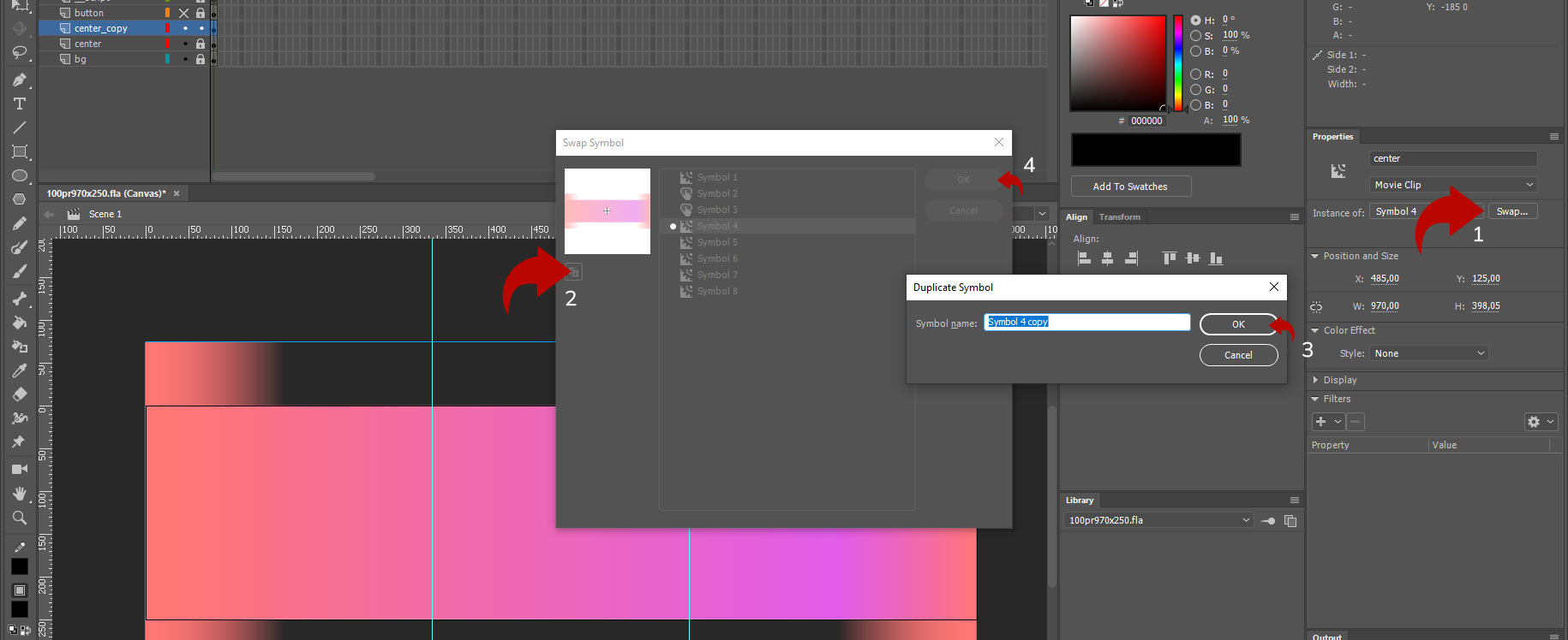
After these steps, the movie clip "center_copy" will be unique and will not affect what happens in the clip "center".
The next step is to tidy up the layer names and the "Label". Let's name our mobile version "center_mob". Double-click on the layer name "center_copy" to enter the layer name editing mode and insert the name "center_mob" there.
After that, select our layer "center_mob", and in the "Label" panel in "Properties", specify the name "center_mob".
Then, go to our script by pressing the F9 key while on the layer with the scripts. Find the line:thisStage.center.x = Math.floor(w / 2 / window.devicePixelRatio);
Copy this line and paste an identical one below it, but change the clip's name to center_mob:
thisStage.center_mob.x = Math.floor(w / 2 / window.devicePixelRatio);
Now, our mobile movie clip will also be centered.
The next step is to specify at what screen width the desktop and mobile movie clips should be visible to the user. To do this, we will use the alpha parameter in the banner code. Let's write the following code with conditions for displaying movie clips:
if ((w / window.devicePixelRatio) > 969) {
thisStage.center_mob.alpha = 0;
thisStage.center.alpha = 1;
}
if ((w / window.devicePixelRatio) < 970) {
thisStage.center_mob.alpha = 1;
thisStage.center.alpha = 0;
}
What does this code mean? The line "if ((w / window.devicePixelRatio) > 969)" tells us that if the screen width "w" is greater than 969 pixels (greater means that the calculation will start from a width of 970. For example, if we used the comparison symbol ">=", it would mean "greater than or equal to", and then the value 969 would also be included in the calculations), then the code inside the condition should be executed.
The conditions are to set the "thisStage.center_mob.alpha" transparency to zero, and the "thisStage.center.alpha" transparency to 100%.
The second condition "if ((w / window.devicePixelRatio) < 970)" means that if the width is strictly less than 970, or equal to 969, then the conditions should be executed.
The conditions are to set the "thisStage.center_mob.alpha" transparency to 100%, and the "thisStage.center.alpha" transparency to 0%. That is, the opposite.
In simple terms, if the width is more than 970 pixels, we see the desktop clip, and if it's less, we see the mobile clip.
Now, we need to develop the mobile version of the animation and see how our stretch works in practice.
To do this, close the code editor by pressing the "F9" key, and double-click to enter the movie clip named "center_mob".
Inside the first layer, we see text animation. It is IMPORTANT to understand that text animation is also inside the same movie clip used in the desktop version. Therefore, before changing the text, we also need to duplicate the clip and obtain a unique object.
The fastest and most convenient method I use in my work is to select all animation points using the "Edit Multiply Frames" tool. Let's choose it, then, in the adjacent settings, indicate that it should work across the entire timeline width.
After that, select all animation points by pressing ctrl+A, go to the "Properties" panel, click the "Swap" button, and inside it, duplicate the clip with a unique name:
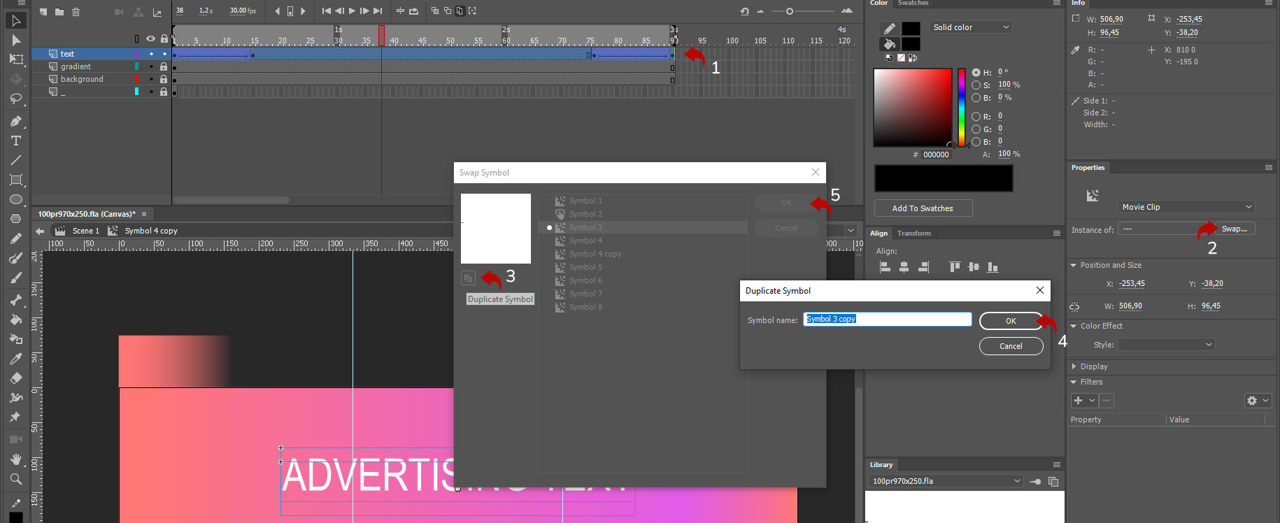
Now we have a unique movie clip that we can modify. Let's enter the clip with text and change the text to "MOBILE ADVERTISING TEXT" and if necessary, adjust the font size so that the text fits within our guides. Approximately like this:

Everything is ready!
Final code for stretch with two or more breakpoints:
We now have everything set up for working with two breakpoints. There are separate animations inside the clips for different resolutions, and there's a script controlling the display of these clips.// "this" variable
var thisStage = this;
// Listen to browser changes
window.addEventListener("resize", resize, false);
// Function resize()
function resize() {
// Special settings
var w = window.innerWidth * window.devicePixelRatio;
stage.canvas.width = w;
stage.canvas.height = 250 * window.devicePixelRatio;
stage.scaleX = stage.scaleY = window.devicePixelRatio;
stage.canvas.style.width = window.innerWidth + "px";
stage.canvas.style.height = "250px";
// Border settings
stage.canvas.style.border = "1px solid #000000";
stage.canvas.style.boxSizing = "border-box";
// Position on stage
thisStage.center.x = Math.floor(w / 2 / window.devicePixelRatio);
thisStage.center_mob.x = Math.floor(w / 2 / window.devicePixelRatio);
if((w/window.devicePixelRatio)>969){
thisStage.center_mob.alpha = 0;
thisStage.center.alpha = 1;
}
if((w/window.devicePixelRatio)<970){
thisStage.center_mob.alpha = 1;
thisStage.center.alpha = 0;
}
thisStage.bg.x = Math.floor(w / 2 / window.devicePixelRatio);
thisStage.bg.scaleX = w / window.devicePixelRatio;
thisStage.mainBtn.x = Math.floor(w / 2 / window.devicePixelRatio);
thisStage.mainBtn.scaleX = w / window.devicePixelRatio;
}
// One-time calling function
resize();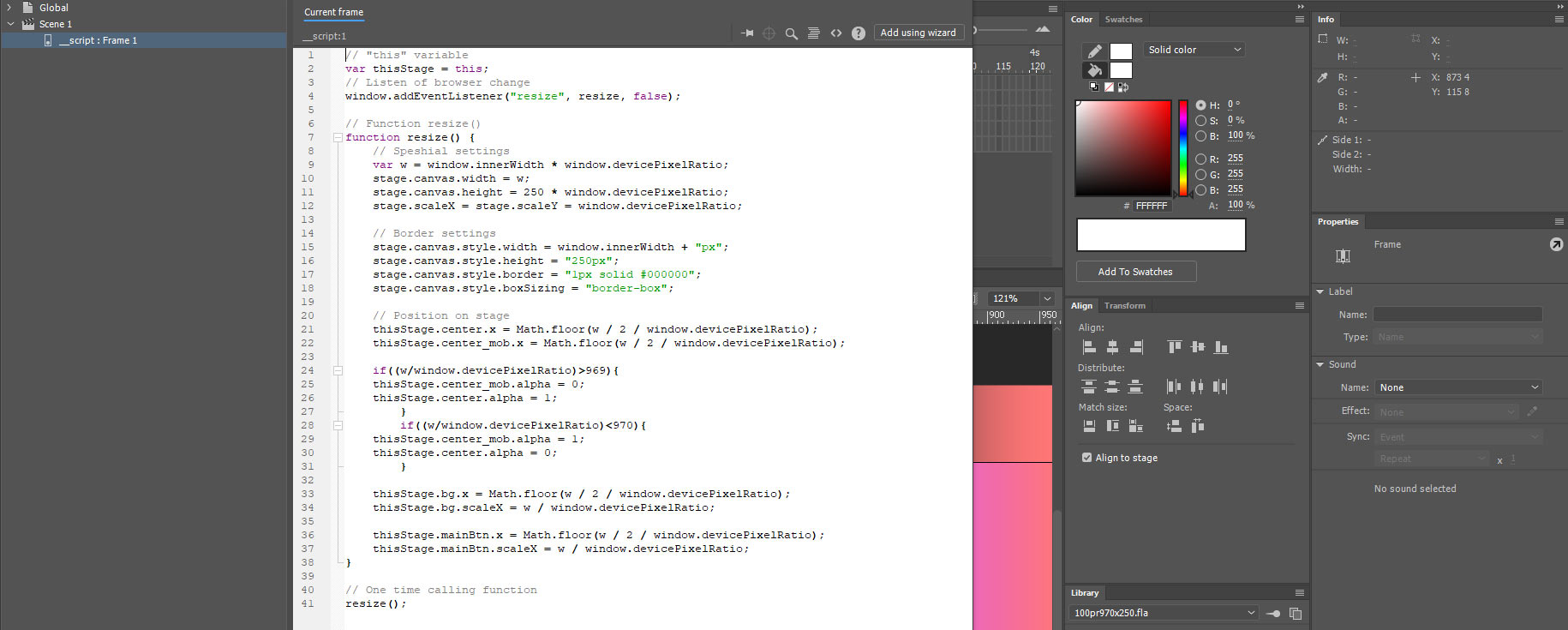
Source files with compiled files can be found here - Level 1 source.
Level 2. Width stretching and positioning content at percentage and exact positions relative to the banner widthWe have learned how to create stretching with two or more breakpoints, how to turn content on and off at different resolutions. Now it's time to talk about more complex content positioning on the stretch.
A bit of theory
If you have encountered various brand guidelines from different companies, you may have seen quite strict requirements regarding the margins of different elements. It's not uncommon to see strict placement of a logo in the top right corner with a 10-20 pixel margin from the upper right corner. Meanwhile, the content should be freely positioned in the center of the screen.
In such situations, central content positioning won't work since the right-side margins will be violated. For such cases, we will consider scripts from the perspective of managing precise element positioning.
For further study, let's take the source from Level 0. Download the materials from this link and let's get started.When working with stretches, it's important to understand that their content (usually) consists of three parts: the left, center, and right parts of the content. If we look at the general scheme of stretch work, it looks like this:

In this scheme, we see three separate blocks. Essentially, they will be individual movie clips, the positioning of which we will control.
Positioning points of movie clips in the stretch
Also, note that the background and click button of our stretch still stretch across the entire window width and fill all the visible space.
Depending on the task, you may have three independent movie clips or fewer or more. For example, if your banner only has a logo on the right side with a strict margin of 20 pixels and all the other content is centered, then there will be two movie clips.Before we proceed with the stretch development, it's important to understand the significant aspect of the point around which the scripts controlling the stretch elements' movement will operate in relation to the banner's stretching.
So, all stretch movie clips have a specific width, and the script that will control the stretch's positioning will refer to a specific point of that movie clip. If we recall, when creating a movie clip, we selected an anchor point. This anchor point tells us where the coordinates within that movie clip will be located. For example, if the center anchor point is selected, the coordinates will be strictly in the center of the movie clip; if it's on the top right, the coordinates will be counted from the top right corner.
Let's take a look at some examples:

Our goal is to somehow indicate to the movie clip that a "certain" point is the interaction point with the script. For these purposes, we will select the movie clip, then activate the transformation tool with the "Q" key and see a small white point, which we can move to any place using the mouse cursor. This particular point serves as the reference point for this movie clip when working with scripts.
Preparing the logo for script control
Let's draw the logo. To do this, remove the blue square, and in its place, create the design of a simple rectangular-shaped logo. Then place it inside a movie clip and position it at the right and top sides of the banner with 30-pixel margins.

Let's also set the transformation point for this movie clip to the top right corner.

Why did we set it to the top right corner? It's simple. In the scripts, we only know the distance of the entire open browser window. Accordingly, we just need to subtract 30 pixels from the entire width, and we will get the precise location we need.
The final touch is to give a name to our logo. Select it, go to the "Properties" panel, and set the "Label" with the name "logo_mc".
All our preparatory work is done. We can now proceed to work with the script controls.
Writing a script to control the logo's positionLet's move to the scripts. To do this, select the layer with the scripts and press F9. Let's find the line "thisStage.center.x = Math.floor(w / 2 / window.devicePixelRatio);" and copy it.
Paste a duplicate of this line below and replace the name of the central movie clip "center" with the name of our logo movie clip "logo_mc". Next, look at what's inside the brackets "(w / 2 / window.devicePixelRatio)". Here, it says that we need to divide all the visible space by two. But we need to position the logo with a 30-pixel margin from the right edge. To achieve this, rewrite the code inside the brackets as follows: ((w - 30) / window.devicePixelRatio). So, the final script for positioning the logo looks like this:
thisStage.logo_mc.x = Math.floor((w - 30) / window.devicePixelRatio);
Now we have two lines of code that control the positioning of two movie clips in the banner.
Congratulations! Now you can separately control two objects individually.
Checklist for creating a new separately controlled object on the stage:
1. Create the design of the object. 2. Place the design in a separate movie clip. 3. Specify the positioning point for the movie clip. 4. Give the movie clip a Label name in the "Properties" panel. 5. Add an additional line in the script for positioning the object.
As a practice exercise, let's create another movie clip on the stage. This will be some textual information that should be positioned in the bottom left part of the stage and have a margin of 5% from the banner's edge.

Let's explain only point 5 here. We need to give the text object a position of 5%. To do this, we need to multiply the entire known distance in the variable "w" (which is actually 100%) by 0.05. Therefore, there we get the necessary 5%.
Finalize the resulting code:
That's it. You can now export the banner and launch the HTML file.// "this" variable
var thisStage = this;
// Listen to browser changes
window.addEventListener("resize", resize, false);
// Function resize()
function resize() {
// Special settings
var w = window.innerWidth * window.devicePixelRatio;
stage.canvas.width = w;
stage.canvas.height = 250 * window.devicePixelRatio;
stage.scaleX = stage.scaleY = window.devicePixelRatio;
stage.canvas.style.width = window.innerWidth + "px";
stage.canvas.style.height = "250px";
// Border settings
stage.canvas.style.border = "1px solid #000000";
stage.canvas.style.boxSizing = "border-box";
// Position on stage
thisStage.center.x = Math.floor(w / 2 / window.devicePixelRatio);
thisStage.logo_mc.x = Math.floor((w - 30) / window.devicePixelRatio);
thisStage.text_mc.x = Math.floor((w * 0.05) / window.devicePixelRatio);
thisStage.bg.x = Math.floor(w / 2 / window.devicePixelRatio);
thisStage.bg.scaleX = w / window.devicePixelRatio;
thisStage.mainBtn.x = Math.floor(w / 2 / window.devicePixelRatio);
thisStage.mainBtn.scaleX = w / window.devicePixelRatio;
}
// One time calling function
resize();
You can find the source files here for Level 2.
A few thoughts in conclusion
After creating the above elements on separate layers, we will get the following structure of the HTML banner.It is essential to understand that all movie clips you move using scripts can have animations inside them. Therefore, it's always better to assemble all the animations at a fixed size to ensure you have correctly distributed everything on the stage. Only after being fully confident in this should you divide the animation into different movie clips.
Remember, there are already 4K and larger monitors in the world. These are extremely wide screens, so you must be extremely careful when creating separate movie clips with their positioning on the sides of the banner. It's not uncommon to encounter a situation where the stretch on a website has no restrictions on the maximum width, resulting in an entirely unreadable advertisement banner on large monitors. If I can't check the stretch example on the platform, or if there are no restrictions on the maximum width in the tech task, I always create the stretch with centralized information placement.
The more breakpoints you create, the larger the exported JavaScript file will be. When you duplicate animation for a new breakpoint, all that animation increases the banner's size. You may easily find yourself in a situation where you simply cannot compress the banner's content. Personally, I almost always use two breakpoints - mobile and desktop.
I hope the material was useful to you. Use it, try it out, and provide feedback. I'm always ready to answer questions in the VK group (link in the website header).

